The debate between serif and sans serif fonts has been ongoing for years, with advocates on both sides passionately defending their preferred typeface. However, a definitive analysis of the issue reveals that the choice between serif and sans serif fonts ultimately comes down to personal preference and the specific context in which the text will be used. While serif fonts are often seen as more traditional and formal, sans serif fonts are considered more modern and clean. In terms of readability, some studies suggest that serif fonts may be slightly easier to read in print, while sans serif fonts may be more legible on screens.
Ultimately, the best font choice will depend on the intended audience, the purpose of the text, and the overall design aesthetic. It is important for designers and writers to carefully consider these factors when selecting a font, rather than adhering to strict rules or guidelines. By approaching the serif vs. sans serif debate with an open mind and a willingness to experiment, individuals can find the perfect font for their specific needs.

The Argument for Sans Serif Fonts
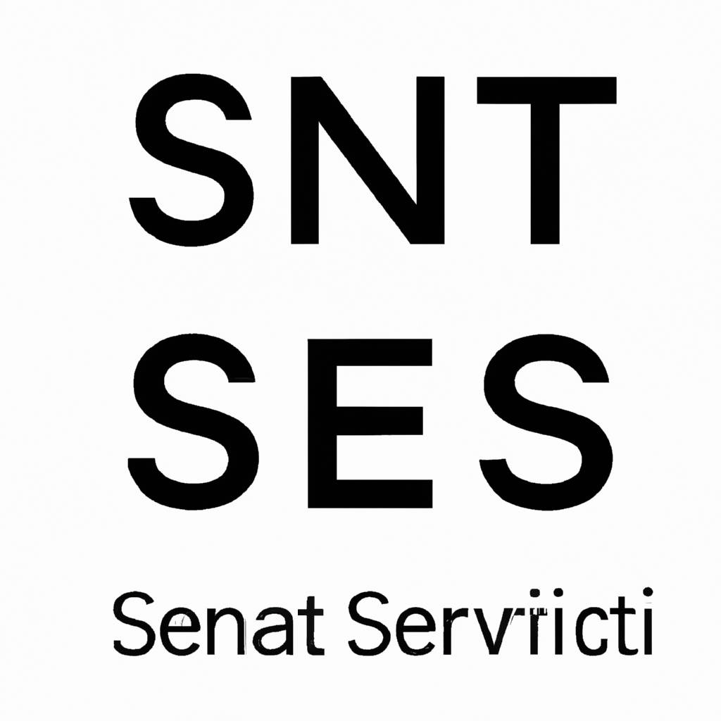
Sans serif fonts have been gaining popularity in recent years for a variety of reasons. One of the main arguments in favor of using sans serif fonts is their readability. The clean and simple lines of sans serif fonts make them easier to read, especially when displayed on screens or at small sizes. This can be particularly important for individuals with visual impairments or dyslexia, who may find it easier to process information presented in a sans serif font.
Additionally, sans serif fonts are often preferred for their modern and sleek appearance. They are commonly used in branding and advertising to convey a sense of professionalism and sophistication. Another argument in favor of sans serif fonts is their versatility. They can be easily adapted to different design styles and are less likely to clash with other design elements. This makes them a popular choice for websites, logos, and other visual communications. Overall, the argument for sans serif fonts is that they offer a clean, modern, and easily readable option for typography that can enhance the overall design and user experience.
Making the Case for Serif Fonts
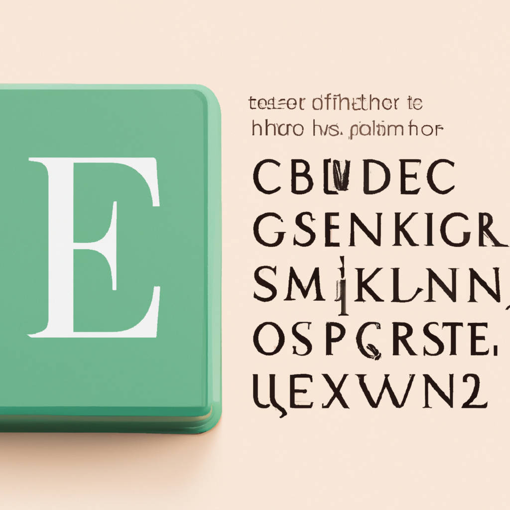
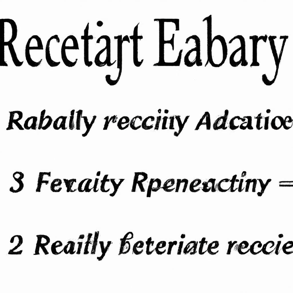
Serif fonts have long been a staple in typography, offering a sense of tradition and sophistication that can elevate any design project. These fonts are characterized by the small lines or strokes that extend from the ends of letters, providing a sense of continuity and flow that can make text easier to read. While sans-serif fonts have gained popularity in recent years for their modern and clean aesthetic, serif fonts offer a timeless elegance that can add a touch of class to any piece of writing.
Additionally, serif fonts are often considered easier on the eyes, as the serifs help guide the reader’s eye along the text, making it easier to follow lines of text without getting lost. In addition, serif fonts are often used in print materials such as books, magazines, and newspapers, as they have been shown to improve readability and comprehension. Whether you’re designing a website, creating a logo, or crafting a brochure, serif fonts can help give your project a polished and professional look that will leave a lasting impression on your audience. So next time you’re choosing a font for your next design project, consider making the case for serif fonts and see how they can take your work to the next level.

Tradition Meets Timelessness
The intersection of tradition and timelessness is a fascinating concept that speaks to the enduring nature of certain cultural practices and beliefs. These traditions are deeply rooted in history and have been passed down through generations, maintaining their relevance and significance over time. The beauty of tradition meeting timelessness lies in its ability to connect us to our past while also resonating with us in the present. It is a reminder of our shared heritage and the values that have shaped our identities.
Whether it be through rituals, ceremonies, or customs, these timeless traditions serve as a link between our ancestors and future generations, bridging the gap between the past and the future. They provide a sense of continuity and stability in an ever-changing world, offering us a sense of grounding and belonging. In a rapidly evolving society, where trends come and go, tradition meeting timelessness serves as a constant reminder of our roots and the values that have stood the test of time. It is a celebration of our cultural heritage and a testament to the enduring power of human connection. As we continue to navigate the complexities of modern life, it is important to cherish and preserve these timeless traditions, as they serve as a guiding light in a world that is constantly in flux.
Legibility and Readability Factors
Legibility and readability factors are essential components in creating effective communication materials. Legibility refers to the ease with which the text can be read, while readability refers to how easily the text can be understood. Factors that affect legibility include font size, spacing, and contrast. Choosing a font size that is too small or a font style that is difficult to read can hinder legibility. Proper spacing between letters and lines can also impact how easily the text can be read.
Contrast between the text and background color is another important factor in legibility, as poor contrast can make the text difficult to decipher. Readability factors include sentence structure, vocabulary choice, and overall organization of the text. Using complex sentence structures or technical language can make the text harder to understand, while breaking up the text into smaller paragraphs and using clear headings can improve readability. Ultimately, ensuring that both legibility and readability factors are taken into consideration when creating communication materials is crucial for effectively conveying information to the intended audience. By paying attention to these factors, communicators can create materials that are easy to read and understand, leading to better engagement and comprehension.

Versatility: Adapting to Various Needs
Versatility is a crucial skill that allows individuals to adapt to a wide range of situations and needs. Being versatile means being flexible and open-minded, willing to learn new skills and approaches in order to succeed in different environments. Whether it’s in the workplace, social settings, or personal relationships, being versatile can help individuals navigate challenges and overcome obstacles. For example, a versatile employee is able to switch between tasks and roles easily, taking on new responsibilities and learning new skills as needed. In social situations, someone who is versatile can adapt to different personalities and communication styles, making it easier to connect with a diverse group of people.
In personal relationships, versatility allows individuals to be understanding and empathetic, able to adjust their behavior and responses based on the needs of their partner or friend. Overall, versatility is a valuable trait that can help individuals thrive in a variety of situations and circumstances, enabling them to be more adaptable, resilient, and successful in whatever they set out to achieve. By embracing versatility and being open to change and growth, individuals can continue to evolve and improve themselves, becoming more well-rounded and capable individuals in the process.
Serif vs. Sans Serif: Decisive Comparison
Serif and sans serif fonts are two of the most commonly used typefaces in graphic design and typography. The main difference between the two lies in the presence or absence of small lines or “serifs” at the ends of the strokes in serif fonts. Serif fonts are often seen as more traditional and formal, while sans serif fonts are considered more modern and clean. When it comes to readability, serif fonts are often preferred for printed materials such as books and newspapers, as the serifs help guide the eye along the text.
On the other hand, sans serif fonts are often used for digital displays and websites, as they are considered easier to read on screens. In terms of aesthetics, serif fonts are often seen as more elegant and classic, while sans serif fonts are seen as more contemporary and minimalist. Ultimately, the choice between serif and sans serif fonts depends on the context and the message that the designer wants to convey. Both have their own strengths and weaknesses, and it’s important to consider these factors when choosing a font for a design project.

Conclusion
In conclusion, it is important to consider the consequences of our actions and decisions. Every choice we make has an impact, whether it be on ourselves, others, or the world around us. It is crucial to reflect on the potential outcomes of our behavior and consider how it aligns with our values and beliefs. By taking the time to think critically about the choices we make, we can ensure that we are living in alignment with our principles and contributing positively to society. It is also important to remember that mistakes are a natural part of life and can provide valuable lessons for growth and self-improvement.
Rather than dwelling on past missteps, it is more productive to use them as opportunities for learning and personal development. Ultimately, the key is to strive for integrity and authenticity in all aspects of our lives, making choices that are guided by our inner compass and align with our true selves. By doing so, we can live a more fulfilling and purposeful existence, creating a positive ripple effect that extends beyond our immediate surroundings. In the end, it is not about being perfect, but rather about being mindful and intentional in our actions, always striving to be the best version of ourselves that we can be.
